Did you know that Augmented Reality (AR) and Virtual Reality (VR) are changing the design world? They let designers use new ways to apply design principles. AR and VR mix digital stuff with our world and give us deep digital dives. This makes our designs better and opens up new creative paths. So, what is AR and VR?
The principles of design guide us on this creative path. They help us make our work look and work better, no matter what we’re designing. By using balance, contrast, alignment, repetition, and proximity, we make designs that grab attention and share our ideas well. Knowing these principles is key to unlocking our creative potential, whether we’re making logos, websites, or products.
Key Takeaways
- Augmented Reality (AR) merges digital content with real-world environments, offering interactive experiences.
- Virtual Reality (VR) provides fully immersive digital spaces for exploration and interaction.
- Proficiency in AR and VR enhances designers’ marketability and relevance in the job market.
- The principles of design—balance, contrast, alignment, repetition, and proximity—are essential for creating effective visual communication.
- Applying design principles elevates the aesthetic and functional quality of various design mediums.
- Immersive technologies like AR and VR revolutionize the design thinking process by enhancing ideation, prototyping, and user testing.
Introduction to Design Principles
Design principles are key to making great things. They help us create harmony and clarity in our designs. Important elements like typography, grid systems, and white space are crucial for clear communication.
The heart of design is the visual hierarchy. It organizes content so the most important parts grab your attention first. This makes the design easy to follow and more impactful.
Designers thrive on trying new things and working together. This way, they can come up with fresh ideas that really connect with people. Keeping up with new trends and tech is also important to stay ahead.
In today’s world, making empathetic design is more important than ever. It’s about knowing and meeting the needs and feelings of our audience. By using feedback and data, designers can make their work better for everyone.
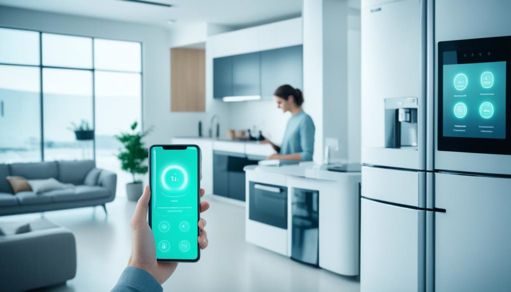
Designers must keep up with new tools and platforms. From mobile apps to AR, the ways we interact with design are always changing. AR, for example, is becoming more popular in entertainment, marketing, and education.
The technology we use and how we interact with it also shape the user experience. This can include gestures, prompts, or voice commands. Testing our designs is key to making sure they work well for users.
By focusing on empathy and innovation, we create designs that are not just beautiful but also meaningful. As we improve our skills, our goal is to make products and experiences that inspire and engage deeply.
| Aspect | Description |
|---|---|
| Typography | Essential for readability and conveying the right tone. |
| Grid Systems | Provides structure and alignment to design elements. |
| White Space | Offers clarity and prevents overwhelming the viewer. |
| Visual Hierarchy | Guides the user’s eye to the most important aspects first. |
| Empathetic Design | Focuses on understanding and meeting user needs. |
| Innovation in Design | Encourages exploration and adoption of new techniques and trends. |
| Impactful User Experiences | Creates meaningful and engaging interactions with the design. |
Foundation of Design: Balance
Understanding balance in design is key to achieving visual harmony. It’s like a seesaw, where both sides must balance for a stable and engaging look. Whether using symmetry or an asymmetrical design, the goal is to create calm and approachability.
Symmetry vs Asymmetry
Symmetry in design means creating a balanced, mirrored layout. It often results in a harmonious and pleasing look that feels natural. On the other hand, asymmetrical design uses different weights on each side, adding interest and dynamism. Both methods help keep the design stable, preventing any part from dominating.
Visual Equilibrium
Visual equilibrium is vital for capturing the viewer’s attention and making a design feel complete. Like an artist using a mirror, we should view our work from different angles. This helps achieve the perfect balance, improving user engagement and immersion.
These principles apply across various fields, including user interface and user experience design. They are especially important for augmented reality (AR) and virtual reality (VR). An article on designing for AR highlights the importance of user interaction and environment.
User research is crucial for creating AR experiences that are both user-friendly and engaging. For example, apps like Google Maps and Ikea’s Place use balance to improve user experience. Social media platforms like Facebook, Instagram, and Snapchat also use Social AR to increase user interaction and brand awareness.
Contrast as a Design Tool
Contrast is key in design, helping us grab attention and guide the viewer’s eye. We use color, size, shape, and texture to make designs pop and clear. This makes our designs visually appealing and easy to understand.
Using Color, Size, and Shape
Color contrast is a strong tool to draw eyes and highlight important parts. Bright, contrasting colors make key elements stand out, guiding the viewer’s gaze. Size and shape also play a role, adding to the design’s hierarchy and focus.
Different shapes and textures add to the design’s appeal. They make the layout lively and engaging. The mix of contrasting shapes and colors balances complexity with unity, making the design effective.
Highlighting Key Elements
Good contrast makes important parts of the design pop. By focusing on key elements, we ensure the viewer sees what we mean. This boosts the design’s message and keeps it clear.
Contrast helps put the most critical parts of the design first. This way, the audience sees things in the right order. It makes the design clear, engaging, and easy to understand.
| Design Tool | Primary Focus | Common Applications |
|---|---|---|
| Color Contrast | Highlighting Key Elements | Typography, Visual Hierarchy, UI Design |
| Size and Shape | Emphasizing Importance | Graphic Design, Branding, Advertising |
| Texture | Adding Visual Interest | Web Design, Print Media, User Interfaces |
Using contrast wisely makes our designs not just pretty but also clear and effective. By mastering contrast, we make our designs more engaging and memorable.
What is AR and VR
Augmented Reality (AR) and Virtual Reality (VR) are big steps forward in digital design. They change how we see and interact with the world. AR adds digital stuff to our real world, making it more interesting. VR, on the other hand, takes us into a world that’s not real, cutting us off from the outside.
The world of extended reality (XR) is growing fast. It includes AR, VR, and mixed reality. In 2022, it was worth $29.26 billion. By 2026, it’s expected to hit over $100 billion. This shows how quickly AR VR technology is becoming important in many fields.
The gaming and entertainment world loves AR and VR. Devices like the Meta Quest 2 and PlayStation VR 2 show what VR can do. They use cool tech to make us feel like we’re really there, giving us new feelings and experiences.
AR, like Microsoft HoloLens and Google Glass, adds digital stuff to our real world. Most people use AR on their phones, like in Pokemon Go. But making AR headsets that are easy to use and affordable is still a challenge.
Mixed Reality (MR) is a mix of AR and VR. Now, VR headsets can also do AR things, like see the real world around us. This makes MR a new and exciting area to explore.
The market for AR, MR, VR, and XR is expected to grow a lot. It will reach $125.2 billion by 2026, growing 30.6% each year. This shows how AR VR technology is being used in more places, like gaming, education, and healthcare.
| Component | AR | VR |
|---|---|---|
| Devices | Microsoft HoloLens, Google Glass | Meta Quest 2, PlayStation VR 2, Valve Index |
| Experience | Overlays digital elements onto real-world view | Immerses users in a completely virtual environment |
| Access | Smartphones (e.g., Pokemon Go) | VR headsets |
| Market Worth (2022) | $29.26 billion | |
| Projected Market Worth (2026) | $100 billion+ | |
| Growth Rate (CAGR) | 30.6% (2021-2026) | |
As AR VR technology gets better, it will change how we see the world. It’s becoming a key part of how we design and interact with digital things.
The Importance of Alignment
Alignment is key in design. It brings order to elements, making visual connections that guide viewers. This makes the design easier to read and shows a brand’s professionalism.
Good alignment leads to an organized design. It makes content flow well, easing the user’s mental effort. This helps avoid confusion and makes navigation easy.
But, bad alignment can cause big problems. It can make it hard for users to understand and mess up the design’s flow. To fix this, brands use feedback loops and new methods like Single Point Active Alignment Method (SPAAM).
Calibration in systems like HoloLens and MagicLeap One shows how important alignment is. It makes mixed reality experiences smooth.
Let’s look at some key points:
| Key Factor | Impact of Proper Alignment | Impact of Poor Alignment |
|---|---|---|
| Cognitive Load | Reduced | Increased |
| User Engagement | Enhanced | Hindered |
| Mental Clarity | Improved | Confusion |
| User Navigation | Intuitive | Disoriented |
Getting alignment right is vital for a design that flows well and looks professional. By improving our alignment methods, we can grab attention, be clear, and engage users better.
The Role of Repetition
Repetition in design is more than just repeating things. It’s a key principle that helps make designs familiar and consistent. Designers use recurring patterns to create unique and memorable designs.
Creating Rhythm and Cohesion
Repetition is often linked to design rhythm. This is when designers use colors, shapes, or motifs in a way that unites different parts of a design. It makes everything feel connected and easy to follow.
Visual elements repeated in a design create a rhythm that users find comforting. This makes the design feel steady and trustworthy. Brands that use the same motifs offer a smooth experience and a sense of familiarity.
Building Brand Recognition
Repetition is key for making a brand known. By using the same elements in logos, colors, and fonts, businesses can make their mark. This makes the brand memorable in a busy market.
Take Apple’s simple design or Nike’s swoosh. These are not random choices. They are repeated to make a strong, recognizable brand image. Through these repeated motifs, they stand out.
| Aspect | Impact of Repetition |
|---|---|
| Rhythm | Creates a seamless and cohesive user experience. |
| Branding | Solidifies brand identity and enhances recognition. |
| User Experience | Establishes familiarity and reliability, making navigation intuitive. |
| Memorability | Ensures the design and brand are easily recalled by users. |
By focusing on design rhythm and cohesive branding, we can make our designs more impactful. This improves the user experience and strengthens our brand’s market presence.
Proximity in Design
The principle of proximity in design is about grouping related elements together. This makes it easier for users to understand the content. By placing elements close, we show their connection, making information easier to process.
Think of a 2D design; proximity is about how close elements are to each other. This way, we create a natural flow of information. It helps users move through the design smoothly.
Design doesn’t need 3D software to work well. Even 2D designs can show spatial relationships effectively. Tools like Sococo and WorkAdventure use 2D to make interactions clearer than old interfaces.
Virtual reality (VR) makes things even more real. It creates a close environment, like real-life interactions. This is shown in this article. Augmented reality (AR) adds another layer, making things feel closer than usual.
VR in architecture shows design problems quickly. Designers use VR tools like Unity and IrisVR for low-cost testing. These tools help us understand spatial concepts better, making designs more user-friendly.
Conclusion
Transformative design principles are key to boosting creativity and innovation. They help us understand balance, contrast, proximity, and repetition. These ideas are not just about looks; they shape digital experiences.
By learning these principles, we make designs more appealing and effective. They connect with users on a deeper level. This is crucial for any design.
The mix of Augmented Reality (AR) and Virtual Reality shows how digital can blend with the real world. AR adds 25% virtual elements to our surroundings, used in education, retail, and design. VR, with 75% virtual, fully immerses us, changing gaming and healthcare training.
This mix of virtual and real opens up new possibilities in many areas. It’s a powerful tool for innovation.
Staying committed to these design principles is essential. As we explore digital experiences and design, we can create more engaging and memorable designs. This approach will shape the digital world of tomorrow.
FAQ
What are the core principles of design?
The main principles of design are balance, contrast, alignment, repetition, and proximity. These elements help make designs look good and clear. They make sure the message gets across well.
How does balance influence creative design?
Balance in design means everything is in harmony. Designers use symmetry and asymmetry to create a calm look. This makes the design feel complete and thoughtful.
Why is contrast important in visual communication?
Contrast makes things stand out by using different colors, sizes, shapes, and textures. It makes sure important parts of the design are noticed. This helps the design communicate better without getting too busy.
What is AR and VR?
AR and VR are new tech that make experiences feel real. AR mixes digital stuff with the real world. VR creates a whole new world to explore. These techs are changing how we design and interact online.
What role does alignment play in professional aesthetics?
Alignment makes things look neat and professional. It helps the viewer follow a clear path. This makes the design easier to read and more effective.
How does repetition contribute to brand recognition?
Repetition uses the same colors, shapes, or patterns to create a sense of unity. This makes the brand more recognizable and memorable. It makes the design more powerful.
What is the importance of proximity in design?
Proximity groups related things together to show their connection. This makes it easier for viewers to understand. It helps clear up clutter and makes the design flow better.
Future App Studios is an award-winning software development & outsourcing company. Our team of experts is ready to craft the solution your company needs.


